Feature: An Explosion of Redheads or Begone, Satan!

Since I've started collecting redheaded book covers they keep following me. They flock towards me.
*whispering*
I think them and Christina's Cover Snark have an unholy pact to hound me until I surrender my life and possibly my immortal soul to them...
...but it might be just my paranoia talking.
Anyway here is a huge list of The Good, The Bad and The Ugly Redheads on the covers per usual.
Enjoy!
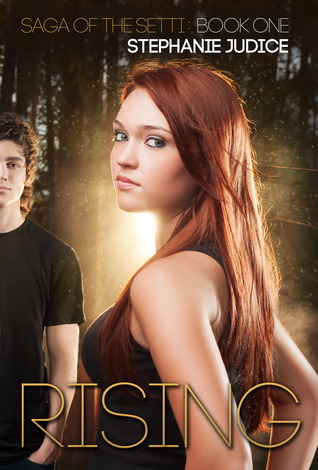
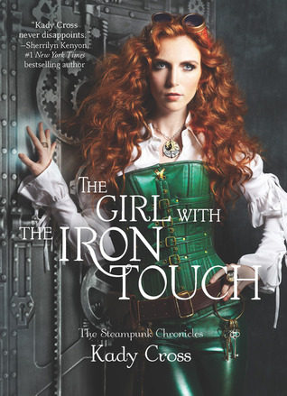
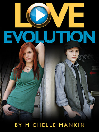
THE GOOD


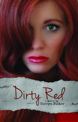
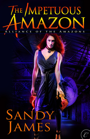
THE BAD

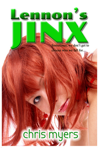


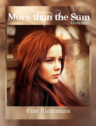

THE UGLY


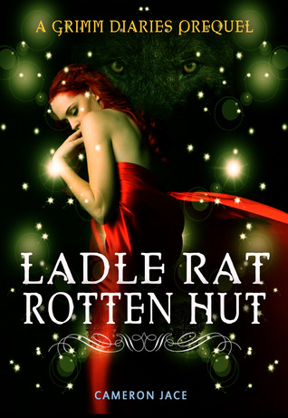


You might sense a theme here. Yup, muted colours and less contrast is much more suited to redheads. You go too far with contrast, you end up in The Ugly pile. You can see that both publishing houses and self-published books make that mistake.
Also less detail and please for the love of all that is holy no dirty overly dyed reds - it's just bad taste.
Another thing I noticed is that masques rarely suit a girl on the cover or in life. The only good one I can think about was

none of the others worked for me.
At last, my absolute favorite from this batch is...
Isn't is gorgeous?
Which one is your favorite?
To see the rest of my reds click here.

The thing with masks, they need to fit well and be picked to suit each person. I personally rock my feathery masquerade mask ;) but it's a really close fit and the feathers fan out around my face.
ReplyDeleteI actually like some of the bad and ugly this time around ;)
ReplyDeleteBut I am going with the girl with the iron touch and the ugly Kiss the crystal sun cos the hair is just so bottle bought
There are actually quite some "bad" covers I liked :p and some of the ugly ones aren't that ugly in my opinion (example: the shadow girl)
ReplyDeleteMel@thedailyprophecy.
I agree, Ellie! The mask has to be just right for you.
ReplyDeleteBlodeuedd, agree about the first one, but the second one hurt my eyes it was that bright ;))
Mel, there are a lot of bad covers I liked - for example More than The Sum, but the typography killed them. Sometimes he book would have looked fab if not for typography... :(
Bahahaha, whatever, you love me and my collection of ginger covers.
ReplyDelete